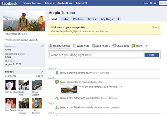
Yesterday facebook launched a redesign campaign for the most popular social network platform in the world. You can view the new facelift yourself at http://www.new.facebook.com and login with your existent username and password.
The redesign will give users more control over their profiles, will help prevent and fight spam and is generally trying to simplify the look and feel of the site. Officials from facebook declared that they want users to have more control of the information presented, they want users to decide what to leave on their sites and what do delete. The new design emphasizes on what people are doing socially and how it can be best shown for each particular individual.
One of the most important things in my opinion is that facebook can listen to it’s users unlike others and they are trying to make things work. The most sensitive subject was probably the privacy criticisms when certain applications have been proved to track and broadcast users habits. But the independent developers are actually another feature that drives content and usefulness to this social network platform and not to be neglected. And two of the the facebook’s top developers Slide Inc. and RockYou had their applications temporary disabled until they the privacy violations will be fixed inside these applications. The changes will aim to reward the designers who are truly trying to make and promote useful applications and will exclude the option to force the users promote an application. The users will have to “OK” now what will appear on their profile without stuff being added automatically.
The main visible change is of course the personal profiles which are organized in tabbed pages now, which is very handy if you ask me. All the applications now (or almost all, not sure how it works yet) are gathered in ‘boxes’ tab, and you can also add some of your favorite applications as separate tabs. The home page feature a news feed which you can adjust to display your interests and in general feels much more well organized. The best part I think is that you will not see any more endless wall posts re-pasted from one wall to another and you’ll get to approve what your visitors see.
All in all the re-design looks to be a success and offers greater usability and privacy. And it is no surprise anymore why MySpace is sinking down while facebook is gaining more users, ’cause they care and they follow the trends. MySpace is planning a re-design as well, but they’re running to late already. I wonder what they are up to actually, cause in terms of design they were always hideously ugly and they have not a clue what usability is. The complete switch to the new facebook look will occur in the next two weeks, enough time to get all tested and fix the bugs, but if you would prefer the current version (old one) there’s always a button in the upper right corner.

